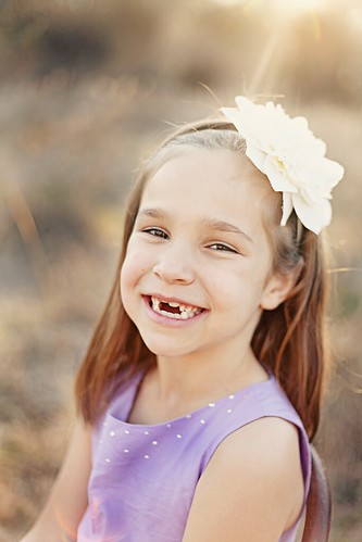
Today is our second edition of "Critique This". Last time was awesome! There are a few changes this time.
In your post let us know if you consider yourself a beginner, intermediate, or pro photographer. Also be specific about what editing software you used. Have fun!
Beginner- Does not know or is learning how to shoot in manual, editing and not yet charging for photo shoots.
Intermediate- New to shooting in manual, editing and just beginning to charge for photo shoots.
Pro - Confident in shooting manual, understands photography lingo, knowledgeable in editing, and charges for shoots.
Here's the low down on what to critique:
- Exposure (is the photo too light or too dark)
- Composition (where are your eyes drawn to, is there negative space)
- Editing (is the photo over-saturated, is the color off)
A few game rules:
- Post one photo
- You can only critique someone else's photo if you are linking up too!
- Be considerate of others when giving feedback
- Link back to Pixel Perfect Blog
I used Photoshop CS4 and actions from Jesh de Rox.
Critique This will be hosted the first and third Monday of every month. See you back here on the 21st!


Hmmm...I'm having a hard time finding anything with this photo. I think the only thing I would have liked to have seen...would have been a little bit more of her eyes. I can tell she has beautiful brown eyes, but she's squinting a little too much. But then again, when photographing kiddos what can you do? LOL
ReplyDeleteI could definitely use some kindly worded critiques with my photos -- I'm trying to learn. Great idea!
ReplyDeleteI can honestly say there is nothing I don't like about this photo: the sun flare is perfect -- not too much; the color is phenomenal -- soft and delicate and lovely; her eyes are bright, even though they are squinchy, and they really let in to her playful personality; the composition is just a bit off centre, which relaxes the eye and diffuses the tension that might be in a perfectly centered subject.
Overall this image is well done! And I really love the flare. The only thing I might like to see different would maybe be more detail in the flower in her hair. It's kind of blown out by the light above...but certainly a great trade off for that flare.
ReplyDeletebrenda